E.g. position: static|fixed|relative|absolute|inherit ;
- static → position itself exactly how it’s coded in the web document and takes up space there i.e default position style.
- fixed → fixes itself in a particular location and doesn’t re-size or reduce in shape and takes up the space there.
- relative → position itself relatively to it’s location and takes up the space there.
- absolute → position itself absolutely to the web document, doesn’t take up space and doesn’t re-size if browser is minimized.
Positioning Using Directions
When using the position property, you can employ the “left,top,right & bottom” property as well to structurally position any given element according to the location where you want the element to be displayed.
E.g. left: auto|length(unit of measurement[i.e px])|%|inherit ;
right: auto|length(unit of measurement[i.e px])|%|inherit ;
top: auto|length(unit of measurement[i.e px])|%|inherit ;
bottom: auto|length(unit of measurement[i.e px])|%|inherit ;
Example 1
We’re going to position two element box and show you how they over lap using the positioning properties.
<html>

<head>
<title>Positioning of Element</title>
<style type="text/css">
.fixed {
position: fixed;
top:10px;
left: 110px;
border: 1px dotted blue;
background: yellow;
width: 200px;
height: 100px;
}
.relative {
position: relative;
top: 0px;
right: -460px;
border: 1px ridge black;
background: pink;
width: 300px;
height: 130px;
}
.absolute {
position: absolute;
left: 200px;
bottom: 10px;
border: 1px groove green;
background: skyblue;
width: 250px;
height: 90px;
</style>
</head>

<body>
<p class="fixed">This is fixed</p>
<p class="relative">This is relative</p>
<p class="absolute">This is absolute</p>
<p> This is some random text, notice how the position value affects this web page</p>
<p> This is some random text, notice how the position value affects this web page</p>
<p> This is some random text, notice how the position value affects this web page</p>
<p> This is some random text, notice how the position value affects this web page</p>
<p> This is some random text, notice how the position value affects this web page</p>
<p> This is some random text, notice how the position value affects this web page</p>
<p> This is some random text, notice how the position value affects this web page</p>
<p> This is some random text, notice how the position value affects this web page</p>
</body>

</html>
Click here to see a stand alone example Position Example 1
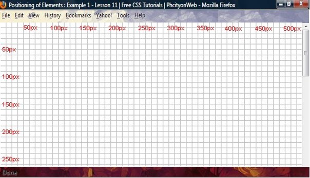
This is how you can position any given element in HTML using CSS, positioning works with your Screen type, so it’s advisable you understand what position an element can be in and how you can structure it on your screen on any system. Look at the image below to understand the positioning of elements on screens and the principles behind it.
Imagine a browser window having a grid like background that has been measured, from any position an element can be fixed.

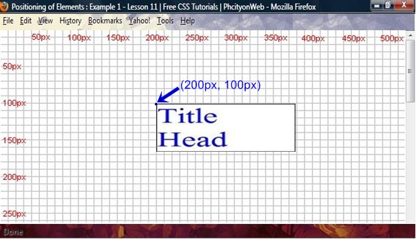
Let’s try to include this Title box inside the screen above.

h1 {
position: relative;
top: 100px;
left: 200px;
}
Now placing this inside the screen positioning above, it will look like this.

As you can see, the positioning of element with CSS is quite easy, it’s more easier than trying to use tables or transparent images.
Using the Overflow Property
You can specify if an element should be visible or not if it overflows the containing element box.
property values for overflow are
E.g. overflow: auto|hidden|scroll|visible|inherit;
p {
border: 1px solid black;
color: green;
position: relative;
width: 300px;
height: 70px;
overflow: visible;
}
/* try another value, use this */
p {
border: 1px solid black;
color: green;
position: relative;
width: 260px;
height: 70px;
overflow: hidden;
}
/*try another value, this one */
p {
border: 1px solid black;
color: green;
position: relative;
width: 300px;
height: 70px;
overflow: scroll;
}
It will look like this on your browser
See how this text flows right out of the box, normally, you can set this to any of the “overflow” values but this is set to “visible” so you can see the flow of text here.
See how this text doesn’t flow right out of the box, normally, you can set this to any of the “overflow” values but this is set to “scroll” so you can actually scroll inside here.
Try practicing some more on positioning of Element, Remember if using the “Fixed Position Value in IE always declare a “<!DOCTYPE>” for it to work. This is the end for the CSS Tutorial, by now you must have learn a whole lot about CSS, practice for perfection. Continue with the other CSS Advance tutorial to learn some few tricks and methods of deploying CSS rules on web pages.
| Back | Main: CSS Programming | Previous Lesson: Floating Elements | Next Lesson: Display: CSS Advanced |


Pingback: CSS Positioning of Elements | Tutorial Review | PhcityonWeb